Safety first. The following information is for educational purposes. CNC machining involves high-speed rotating cutters. Always wear eye and ear protection, never leave a running machine unattended, and verify all feeds and speeds for your specific setup.
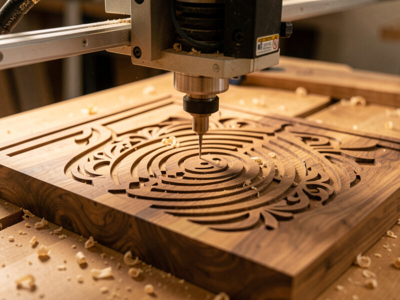
V-carve text is the technique where a single V-shaped bit cuts an entire alphabet by plunging deeper to widen a stroke and rising to narrow it — which is why one 60-degree bit can carve crisp, sharp-cornered letters no flat end mill can match. On the machines I run, it is the first toolpath every sign maker should master, because it loads the gantry almost nothing and rewards good setup with letters that look hand-cut.
The magic, and the confusion, is that V-carving does not cut at a fixed depth. The software calculates how deep to drive the bit at every point so the visible stroke width matches your artwork. Understand that one idea and V-carving stops being mysterious. This guide is how I dial it in across wood, what bit to grab, and the two or three settings that separate clean letters from a fuzzy mess. It is the technique core of the broader CNC sign making workflow.
How V-Carving Actually Forms a Letter
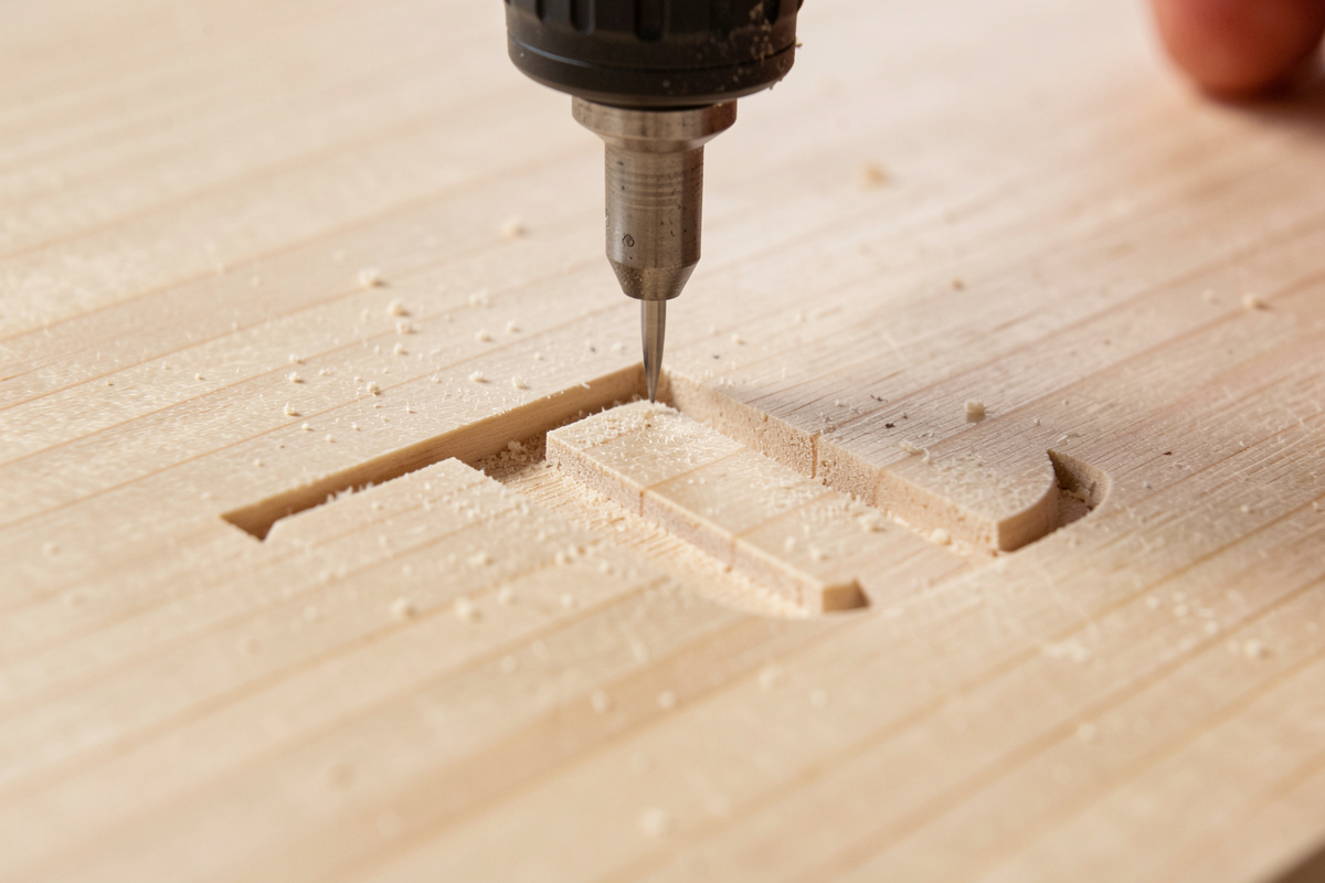
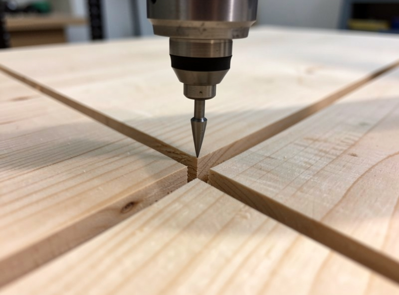
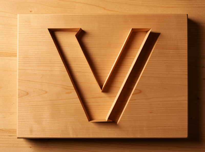
A V-bit is a cone. When the controller drives it 1mm deep, the cone makes a narrow groove; drive it 4mm deep and the same cone makes a wide one. The CAM software traces the centerline of every letter stroke and constantly varies Z so the groove width equals the designed stroke width. The direct result: thick parts of a letter are also the deepest parts, and the bottom of every stroke meets at a sharp, mathematically perfect point.
That is why V-carving nails the inside corner of a serif or the sharp vertex of an A while a flat end mill leaves a radius. The trade-off is depth — a very thick stroke has to cut deep to get wide, which is why a bold display font can plunge surprisingly far into your blank. In my CAM I always preview the deepest point before cutting, because that number decides whether my blank is thick enough. If you want the full V-bit background beyond signs, my V-bit guide and the broader engraving and inlay guide go deeper on the geometry.
Choosing the V-Bit Angle for Your Text
Angle is the first real decision and it changes the whole look. A 60-degree bit is narrower and plunges deeper for a given stroke width, so it carves small text with more depth and more dramatic shadow — my default for address plaques and fine lettering. A 90-degree bit is wider and shallower, clearing bold strokes faster and forgiving a slightly off Z-zero, which makes it the right pick for large, chunky display text.
The practical difference shows up in small fonts. Try to carve 1/2-inch-tall text with a 90-degree bit and the strokes stay shallow and weak; the 60-degree bit gives those same letters real depth and a crisp shadow line. For a 6-inch storefront letter, the 90 clears the wide stroke in far less time. I keep both ground sharp on the bench and choose by the smallest text on the sign. A sharp tip matters more than the angle, though — a quality V-carving bit set covering 60 and 90 degrees covers most sign work.
As an Amazon Associate I earn from qualifying purchases.
| V-Bit Angle | Stroke Look | Best Text Size | Depth for 1/8″ Stroke | My Use |
|---|---|---|---|---|
| 30° | Very narrow, very deep | Tiny fine detail | ~0.11″ | Fine filigree, rare |
| 60° | Deep, sharp shadow | Small to medium | ~0.054″ | Address plaques, default |
| 90° | Wide, shallow | Large, bold | ~0.031″ | Storefront, display text |
The One Setting That Saves Your Blank: Flat Depth
If you carve a bold font with no depth limit, the V-bit will happily plunge through a 3/4-inch board to make the widest strokes their full width. The fix is the flat-depth (or “flat bottom”) setting: you tell the software a maximum depth, and any stroke wider than the V-bit can reach at that depth gets its center cleared flat by a second bit instead of plunging deeper. The direct rule I follow: cap flat depth at the thickness your blank and your finish can tolerate, never leave it unlimited.
For a 3/4-inch sign I usually cap flat depth around 1/4 inch — deep enough for shadow and paint fill, nowhere near blowing through. The software then adds a small clearing toolpath for the wide letter centers, run with a flat end mill, and the V-bit only does the edges. This is also how you carve a giant headline letter on a thin blank without the bit exiting the back. Capping flat depth is the single most common fix I give people whose letters came out absurdly deep.
Feeds, Speeds, and a Clean V-Carve
V-carving is gentle on the machine but unforgiving on finish, because the bit is cutting at a tiny effective diameter near its tip where surface speed is almost nothing. I run my 60-degree bit in hardwood around 18,000 RPM with a feed of roughly 60 inches per minute, and I slow down for the tightest detail rather than speeding up. Going too fast near a sharp letter point leaves a torn tip; going too slow burns. There is a window, and tight-grained wood widens it.
The finish pass matters more than the roughing. I let the V-bit take the final edge as a continuous profile and keep chip evacuation strong so chips do not pack into the groove and recut — a packed groove is a common cause of fuzzy walls. Dust collection is a finish issue here, not just a lung issue. For the full chipload reasoning behind these numbers, my feeds and speeds system and RPM-by-material guide carry the math; the short version is start from the bit maker’s chart and then trust your ears and the chips.
Fonts, Spacing, and Text on a Curve
Not every font V-carves well. Thin single-stroke and ultra-light fonts can come out so shallow they vanish; ultra-bold fonts plunge deep and need the flat-depth trick. I favor fonts with moderate, even stroke weight and real serifs, because serifs are exactly where V-carving shows off its sharp corners. Before cutting, I node-edit any font quirk — a too-tight counter in an ‘a’, an awkward serif — because the bit will faithfully carve every flaw in the vector.
Text on a curve (an arc of letters over a name) is a sign-shop staple, and good CAM software wraps text to a path while keeping each letter upright. Watch letter spacing on tight curves where letters can collide at their bases. I lay the text out at final size, simulate the V-carve preview, and look specifically at whether the bit reaches into every tight inside corner — if it shows an un-carved island, the text is too small for that bit angle and I either go to a sharper bit or scale up.
Why Workholding Decides Your V-Carve
I will not write a sign article without this section, because it is always the real failure. A V-carve barely pushes on the blank, so people clamp loosely and get away with it — until the blank lifts a few thousandths and the bit recuts a stroke, doubling it. The classic “ghost letter” or double-stroke is almost never the toolpath; it is the blank moving or the Z-zero drifting off the surface.
For a flat sign blank I hold the perimeter with low-profile clamps clear of the toolpath, or tape the whole back with double-stick carpet tape for thin stock, or pull it down on a vacuum table for production. Zero the Z on the actual surface of the blank, not on a clamp or the spoilboard, because V-carve depth is measured from that surface. The complete decision tree lives in my workholding guide, and the tape-and-CA method is what I use on blanks too nice to clamp. Get this right and the toolpath is the easy part.
Frequently Asked Questions
What angle V-bit is best for carving text?
A 60-degree V-bit is the best default for sign text. It plunges deeper for a given stroke width, giving small and medium letters real depth and sharp shadow. Use a 90-degree bit for large, bold display text where wide strokes need to be cleared quickly.
Why are my V-carved letters doubled or ghosted?
Doubled strokes almost always mean the blank lifted or the Z-zero drifted, so the bit recut a stroke. Re-check that workholding held the blank dead flat and that you zeroed Z on the blank surface, not on a clamp or the spoilboard.
Why are my V-carved letters way too deep?
The flat-depth setting was left unlimited, so the bit plunged as deep as needed to make wide strokes their full width. Cap the flat depth in CAM to a value your blank can tolerate, and the software will clear wide letter centers with a flat bit instead of plunging deeper.
Can I V-carve small text?
Yes, but use a 60-degree or sharper bit and a tight-grained wood like maple or cherry. Open-grained woods tear at small letter walls, and a wide 90-degree bit leaves small text too shallow. Preview the V-carve in CAM to confirm the bit reaches every inside corner.
Do I need a special bit just for V-carving?
You need a V-bit, which is a cone-shaped engraving bit available in 30, 60, and 90-degree angles. A 60 and 90-degree pair covers almost all sign lettering. Keep the tip sharp, because a dull V-bit tip is the most common cause of fuzzy, rounded letter points.
What feed and speed should I use for V-carving wood?
A 60-degree bit in hardwood runs well around 18,000 RPM with a feed near 60 inches per minute, slowing for the tightest detail. Keep chip evacuation strong so chips do not pack into the groove and recut, which fuzzes the walls.